|
their all very nice, but they all look like they belong to orvis.. in HARWICH.
|
Run whatchya brung..
ONE MORE CAST..... :cool: |
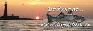
i am so flattered that everyone thinks that my logos look so nice...and that they belong on Orvis or someone expensive....Being an artist I am my own worst critic....Thanks for all the compliments it makes me feel better that everyone thinks they look so professional.....:eek:
~M |
Mike they all look very good frufy is good in advertising. I think numbers 4 and 5 are my favorites. Nice stuff for sure.
Armand |
I like 4 and 5.
Having said that the angry striper is the one....... |
I like the one you got now. Maybe have the same dude(skeleton) at the ditch, one of the bridges in the far back ground with his 1209 and a 7000 laid over;).....whatcha think about that??
|
4 & 5 with 4 being my favorite...additional Logo with angry Bass is Goofy
Styick with One More cast...That is perrfect ... John R said it right for me |
| All times are GMT -5. The time now is 07:36 AM. |
Powered by vBulletin® Version 3.8.7
Copyright ©2000 - 2026, vBulletin Solutions, Inc.
Copyright 1998-20012 Striped-Bass.com